
Learning Hub Course: Basic Dashboard Design Principles
Dive Deeper into Pyramid Use Cases with the Learning Hub
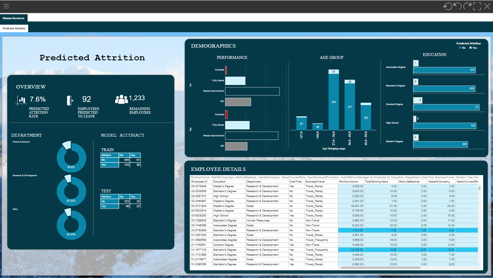
The Use Case: Improving an existing dashboard
This course, designed for professional license holders, walks you through five key design principles to help you create dashboards that are both visually appealing and effective.
You'll be involved in every step of the process, with opportunities to think critically about how the dashboard provided in this course (image above) can be improved.
Learning Objectives
By the end of this course you will be better able to:
- spot design mistakes in your own dashboards
- use design principles to prevent and correct them
- create visually appealing dashboards ready to be shared with your team.
Note: Be aware this course focuses on basic design principles rather than teaching Formatting panel and Design ribbon functionality. Users are expected to be familiar with the Formatting panel in the Present module.
Take the course here:
Basic Dashboard Design Principles for Pro Users
The dashboard can be found here: Starting Dashboard
Let us know what you think!
2 replies
-
Nice one!
I liked the comparison between the current and the improved dashboard with the help of the slider very much! Perhaps I suffer from Right-Left-Weakness but is its description correct? When I move the slider to the left I see the current, not the improved dashboard...
Perhaps not exactly in the scope of this course, but I do not like that the detail views for "Age Group" and "Education" use different visualizations - a stacked column chart and a grouped bar chart. As far as I see the facts could have been presented equally well with either of the two. And why are categories (or the corresponding values) not sorted in any way? An alphabetical sort for age groups? Kind of noisy as well...

My last point: It's very helpful for the consumers to use the same colors for the same things - here the darker blue for "No" and the brighter one for "Yes". When it comes to the "Performance" chart this principle is dropped because now we apparantly need more colors. But: We do not need colors to distinguish between the performance characteristics - we still have the category names (like in "Age Group" and "Education")! So why not have four dark blue bars for "No", and for light blue bars for "Yes"?
But in the end: Nice one! I, at least, dive far too often and far too quickly into the technical tricks of the tool and neglect the theory of representation and perception. Such “other” courses help a lot to draw attention to these important principles!THANK YOU!
Content aside
- 2 Likes
- 1 yr agoLast active
- 2Replies
- 759Views
- 4 Following