
How to build data-driven infographics that tell a better story

Data-driven infographics can be a highly effective way to help users learn new information. The more graphically intuitive an analysis, the quicker and easier it is for users to understand and gain insights from it.
Data-driven infographics use a combination of images, charts, and text that communicate information effectively. They utilize striking and engaging images that, when blended with dynamic text, emphasize critical information more conspicuously than classic business charts, visualizations, and grids.
Pyramid provides an enormously powerful infographic tool—the Illustrate module—that builds dynamic data-driven images and text (covered in my next blog). These illustrations can be collaged and used inside live, interactive presentations and in static report publications—just like any other analytic content item in Pyramid.
The problem
While static graphics add to the appeal of a presentation, they provide minimal value without dynamically morphing to reflect attributes of data. Images would be more meaningful if they could automatically change color or size depending on the value of a specified item, and if they could be modified per a dashboard filter. Additional image properties, like rotation and volume, could enhance the image’s meaning. Further value could be added by simply displaying or hiding an image based on predefined data conditions.
In effect, images could tell a powerful, compelling story if they could change according to data. However, this presents a massive coding challenge. What’s more, most other BI tools only offer basic infographic capabilities. Still others don’t offer them at all, and customers are required to supplement their analytic content using additional technologies.
Pyramid’s solution
Pyramid’s Illustrate module provides the ability to easily create data-driven infographics using any raster images (PNG, JPEG, GIF) or vector images (SVG) together with data-driven text.
Users can adjust the look and feel of an image using data derived from queries in the system, including properties like color, size, rotation, visibility, and volume. In addition, Pyramid’s dynamic text capabilities enable descriptive text to change based on data. For example, a dashboard or report could display a statement like “The California branch achieved 15 percent above its target,” where the values are derived from a query.
All capabilities are delivered through a simple point-and-click interface without complex coding. Infographics and dynamic text can be added to presentations and publications and can be configured to use data interactions from other visualizations and artifacts to create rich, responsive graphical displays of data and information.
Business case
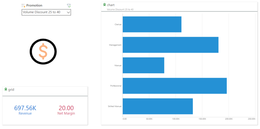
Maria is a BI analyst for Trellicor, a retail company that uses Pyramid on their Snowflake platform, which houses a five billion-row data warehouse. To simplify things for her users, Maria has decided to use data-driven infographics to track performance on promotion dashboards where the color of the image changes based on the net margin values, while the size of the image changes relative to the revenue figures.
Basic infographic
Maria uses the Illustrate tool to create an infographic that can be used in any dashboard. Maria decides to use one of the 100 stock images in Pyramid to drive her infographic. She sets up the color property, selects a stock image of a dollar sign, and then selects a previously created Discovery grid that contains the net margin to drive the color of the image for the corresponding promotion.

Next, Maria sets up the color property ranges—so that the graphic will change color depending on where the margin values fall. Trellicor expects a minimum net margin of 22 percent, so Maria sets the net margin of 20 to be orange and 22 to be green.

Now Maria sets the size properties of the image to change according to revenues. Each promotion is set a target of $900K in revenue. The lowest historical revenue has never fallen below $800k, so Maria selects the revenue field from the grid and uses $800k as the minimum value and $900k as the maximum value, where the size will vary from 50 percent to 100 percent of the image size.

Maria then saves the Illustrate definition. From her dashboard, she simply drops the object into her dashboard and connects the dashboard objects using the “Auto Interact” function.

Maria’s image on the dashboard now displays varying size and color, so the “Touring 1000 Promotion” (LHS) is large and green, as the revenue is close to $900k and the net margin is nearly 22 percent.

The “Volume Discount 25 to 40” promotion is small and orange as the revenue is below $800k and the net margin is only 20 percent.
Custom images
In another exercise, Maria uses custom SVG images for each of the cities that Trellicor operates in London, New York, and Paris. For London, she uses an image of Big Ben to create a more customized view for the London dashboard. She drops her custom image on the Illustrate canvas, clicks on the color property, selects the revenue value from her grid, and defines the range to be used to determine the color.

After inserting the infographic in her London dashboard, her image will change color to reflect the revenue performance. Maria has custom graphics for each of the cities and as each branch (city) changes, the custom graphic for each city will be displayed accordingly.

Summary
Infographics use a combination of striking images and text to present information more intuitively than standard business charts and grids. Dynamically modifying an image’s properties by coding, based on data values, provides a challenge if the tools are not supplied.
Pyramid’s Illustrate module enables—and greatly simplifies—the delivery of infographics with data-driven changes of text and an image’s color, size, visibility, rotation, and volume properties without code. The infographic items can then be added to presentations and publications to give a new perspective on data for users so they can drive better business decisions through data.
Additional Resources
Dynamic Images Help Guide
Getting started with Illustrate Video
Reply
Content aside
- 1 Likes
- 5 yrs agoLast active
- 372Views
- 1 Following