
 Dynamic, Localized Chart Titles
We always want to deliver insights in the user’s language. It makes analytics feel personal, clear, and way more useful.
In Pyramid Analytics, we can translate almost everything - formula names, attribute names, metadata, even auto generated insights can be matched to the user's default language.
But chart titles work a little differently. They stay set to the original saved name we gave to the chart. That means, even when your dashboard language changes, your chart title might not. Unless, you handle it dynamically.
 Switch from Static Titles → Dynamic Text
Here’s a clean way to make chart titles automatically match the selected application language:
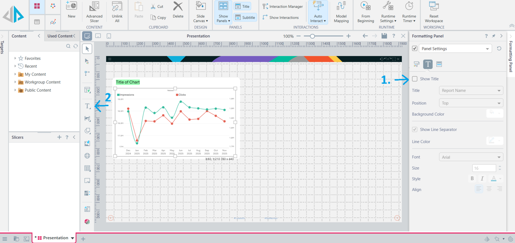
Turn OFF the default chart title field in the presentation layer
Insert a Text Box instead, positioned where the title would normally go
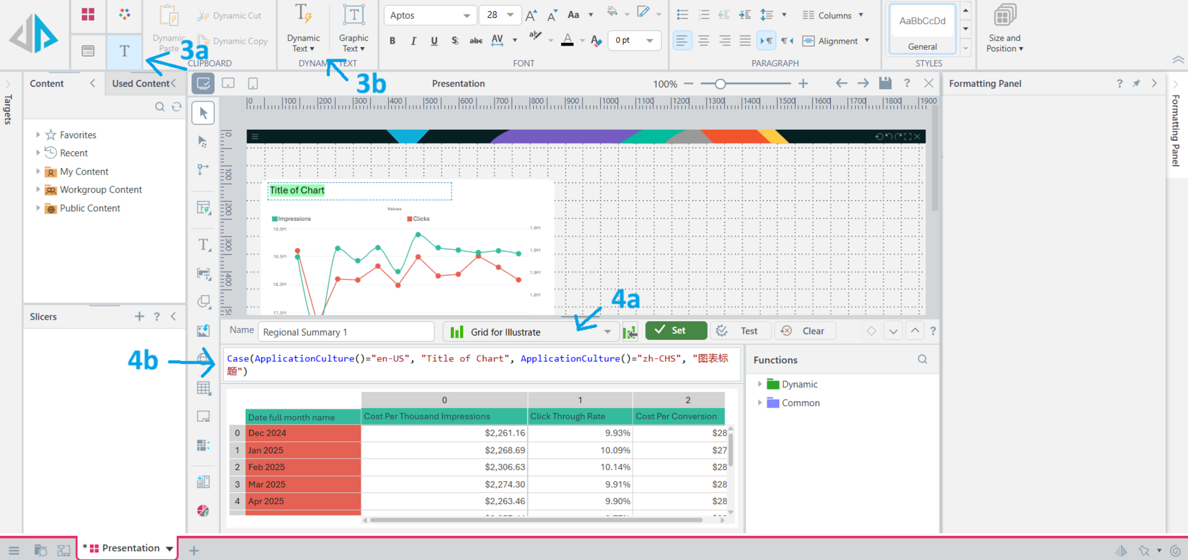
With the Text Box Selected
Click on the Text Ribbon on the top left
Click on Dynamic Text
In the panel that will show up
Select a grid - ideally something simple and is used by the dashboard. Your dynamic text won't work without making a selection here.
Enter your logic using a case statement to match the application language to what the title should be
- Repeat as needed for all your titles
 Taking it further
You can further simplify this by uploading a data table that contains all the names of charts in all the languages you need. That way, you can create a grid and use that to match the application language to the corresponding title in the table instead of manually typing in the formula box.
 A pretty simple tip but I hope its useful. Happy building!
Reply
Content aside
- 3 Likes
- 7 mths agoLast active
- 225Views
- 1 Following