1
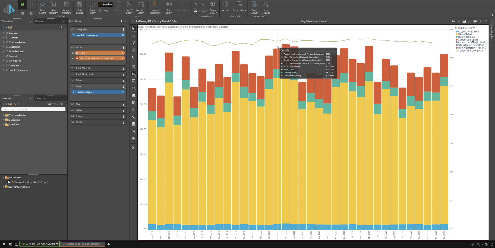
Only primary Y-axis shall be colored...
Dear Community,
I like to have a simple combined chart:
- "SALES by PRODUCT CATEGORY" as stacked column on the primary Y-axis
- "MARGIN" as line chart on the secondary Y-axis
So, it should look like this...
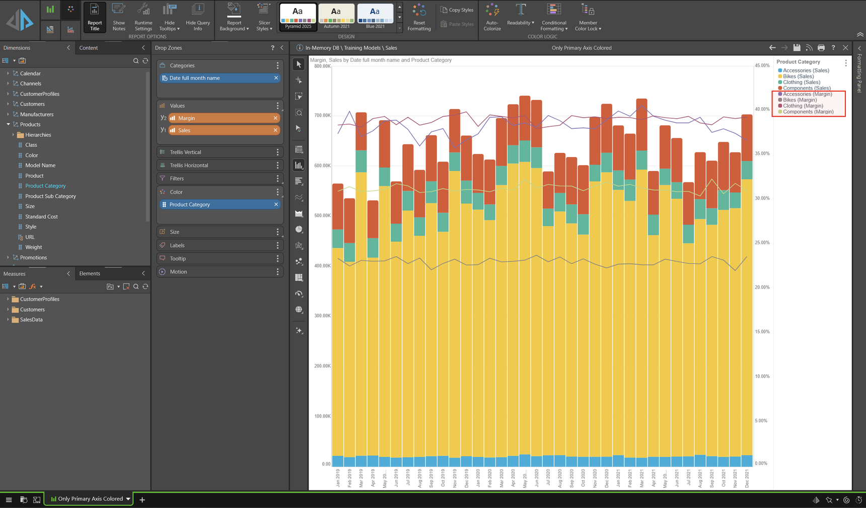
...but the PRODUCT CATEGORY (Color drop zone) should only have an effect on SALES, not on MARGIN. So, I want to have ONE line chart for the overall margin.
(How) Is this possible?
THNAK YOU!!!
Micha
4 replies
-
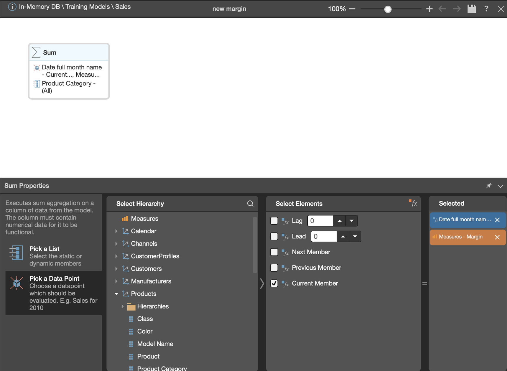
Hey Micha,
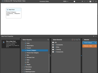
One thing you could do to get just one single line for overall margin would be to create a formula for it and use an aggregation block (I used sum, you can use whatever aggregation you need) where the list is All Product Categories and the data point is current member of your date field. Then instead of margin, drag that formula into your Y2 for the line chart.