0

Tooltip not showing in scatter graph

Hi all,


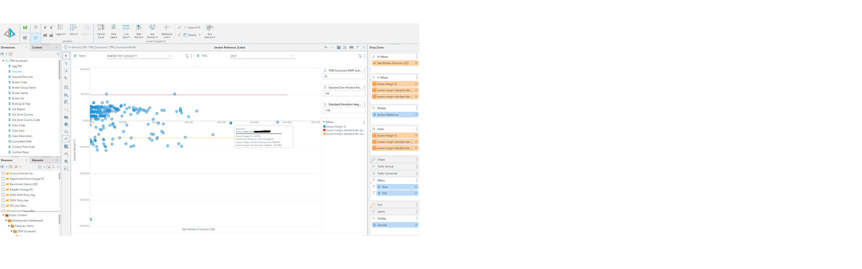
As per the above, when I add the assured name to show in the tooltip or label, it only shows as a *.  Do you know why this might be?


Thanks,

Dan

6 replies

null
    • imbarmarinescubar_pyram
    • 2 yrs ago
    • Reported - view

    Hi Dan Sharman ,

    When seeing * as a value from the tooltip, it means that there are multiple values of Assured for that given Section Reference. If there was a single value then you would have seen it. For example if the Details were Cities and the Tooltip was Country then the Paris dot would show France.

    The columns in the Details drop zone are defining what level to show the chart in, and the tooltip is just a helper. 

    You can add the Assured column into details as well, to so the values of Section Reference broken up by each related Assured.

    Imbar

    • Dan_Sharman
    • 2 yrs ago
    • Reported - view

    Hi Imbar,

    Thanks for getting back to me.  I have just checked this and each section reference only has one type of assured associated to it.  I have put them into a point chart and it works as expected.

      • Dan_Sharman
      • 2 yrs ago
      • Reported - view

      imbar any news on this Imbar?

      • imbarmarinescubar_pyram
      • 2 yrs ago
      • Reported - view

      Hi Dan Sharman ,

      Just to be sure I understand the current situation:
      When adding the Assured column into Details, the tooltip is working as expected?
      Regardless, you checked and Section Reference only has a single value for Assured?

      Could you run another test for me?
      1. Remove the Assured from the report
      2. Right click Assured in the dimension tree -> Aggregate -> Min and Max (create 2 custom measures)
      3. Add the new custom measures to the tooltip and check what the values are for the Section Reference you've tested before, and attach the output here.

      After this check you can revert back the report and delete the 2 new custom measures that where created.
       

      • Dan_Sharman
      • 2 yrs ago
      • Reported - view

      imbar As soon as I drag assured into details drop box the standard deviation lines go everywhere and it looks like a cardiogram- but i CAN see the assured correctly in the tooltip that way. I.e displayed at the top along with section reference and the measures underneath.

      See attached for the assured min max workaround - im guessing to just rename the min or max part and use this instead of the other way of dragging a dimension into the tooltip?


      Thanks

      • imbarmarinescubar_pyram
      • 2 yrs ago
      • Reported - view

      Dan Sharman

      Yes, you can use the min or max as a workaround for now, and rename them.
      However, I would still like to understand what exactly is happening with the dimension.

      Could you please export (print) to excel both variations of the report (the one with Assured in Details and the one with the min and max in tooltip) and attach the excels here?

      If the data is restricted, you can clear out the Selection Reference values and just mark the rows that were related to the 1 item from your images. I want to see and compare the actual values of the Assured in all the different cases.

      Thank you,
      Imbar

Content aside

  • Status Answered
  • 2 yrs agoLast active
  • 6Replies
  • 36Views
  • 2 Following