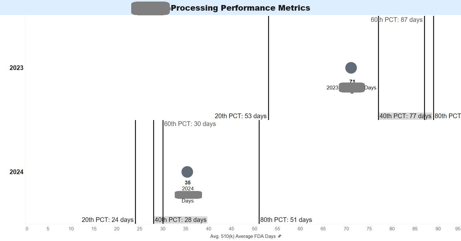
Dot and Ref. Line Plot

I am trying to reproduce a dot and reference line plot in Pyramid. I know what I'd like to do and am having trouble implementing it in Pyramid. I've attached the image of the chart which was prototyped in a different tool. In the example above, the year is a dimension & placed on rows. I have created a dynamic reference line in the prototype where the PCTLs (individual data items) have been associated with each reference line. I could have also done a dual axis chart where I pivoted the columns for the PCTLs into one data item to then have the circle on one axis and the lines on another axis.
However, when I try to do the above actions (tie ref lines to data items) or pivot the PCTL columns, it doesn't work for me.
As a result I have two questions:
- Is it possible to create a reference line based on a data item (and not user input or constant)?
- How would you create this chart knowing that:
- Year is a dimension
- Measures are listed below in the image
- The layout needs to be horizontal for easier readability.
- Dynamically sorted by value so that the position of the lines and dot change as the data changes.
- The goal is a circle (dot) and line (not another shape)...preferably a reference line but a gantt line (something thin) could work. b
Thanks!
Emily

4 replies
-
Thank you, Emily for your question. We have scheduled a call to discuss in more detail.
-
Hi All,
has sent me the step by step instructions to recreate the dot and reference line plot in Pyramid.- Create a your stacked Bar Chart.
- Click on the first measure, under the legend area an click on "Edit "

- Formatting Panel pop up window will appear, make the following selections/adjustments to formatting (repeat this for all the other measures except the one you want to keep as a point chart variable.

- Two little icons drive the color of the bar chart for the selected variable, so here we will select dark color for the left side and white for the right side (see circled, once you click, the color palette will pop up)


Step 5: Drag the right side of the fill type closer to the dark, this will fade the rest of the bar chart for selected variable and create a single line.

Note: Repeat for the other variables, the outcome will be similar to the screen shot below:

Final part is to format the Plot Area:
- Remove the Y Axis Lines:
o Plot Area > Y Axis Lines > uncheck “Show Major Grid Lines”
o Y- Axis > Uncheck “Show Axis Values”
o Activate Data Label under Data Labels section of Formatting Panel


