
Multi-measure pie charts
I have to measures in percentage that add up to 100% and I want to show in one pie chart both of them.
I'm using version 2020.27.113 but it doesn't work for me. Could you please explain how to do it?
3 replies
-
I have to measures in percentage that add up to 100% and I want to show in one pie chart both of them.
I'm using version 2020.27.113 but it doesn't work for me. Could you please explain how to do it?
-
Hi dgf,
It is unusual in most data analytics models to have multiple Measures that together make up the total of that Measure. Usually there is a single Measure and that is split out by the Members of a Hierarchy, like Country, so you get a different coloured slice of Pie for each country as a % of the total.
For that reason, when you add multiple measures to a Pie chart, by default it will "Trellis" the chart, showing a Pie chart for each measure, expecting each Pie chart to be split out by the Members of a Hierarchy. Like this

To get what you need, grab one of the orange measure chips in the Values Drop Zone and while grabbed, hover over the Values Drop Zone Heading. A slide-off will appear. Carefully drop the Measure chip onto the Pie Chart Slide off. It doesn't matter which sub box you drop it into.
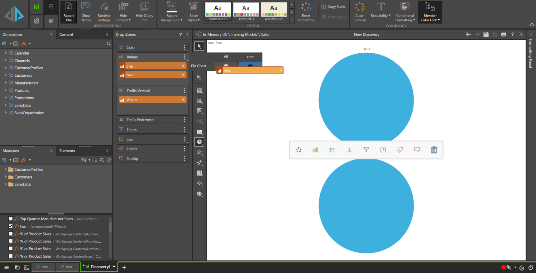
Once dropped, Pyramid will use both Measures to create the Pie. It will auto colorize them, but you can edit the colours from the Formatting options or directly by right clicking on the chips in the Color Drop Zone. You can also delete the Trellis chip as it is now redundant.

I must note here that I am using Pyramid 2023.00. I no longer have access to your version, but I think this feature has been available for some time. If not, then this is another great reason to upgrade!
Hope that helps.
Ian
-
thanks a lot! BTW I also found an easier way to do this - create a measure list at the formulate section and use categories in the drop zone at Discovery section to split it to two separate bars in one bar plot