
Dashboard Gallery: Financial Services

Dashboard Gallery:
Financial Services
Dashboard has been developed as a showcase based on public data. It give you a view into loan data and the connected risks when the loan crisis hit.
High Level Overview about KPIs, trends and risk

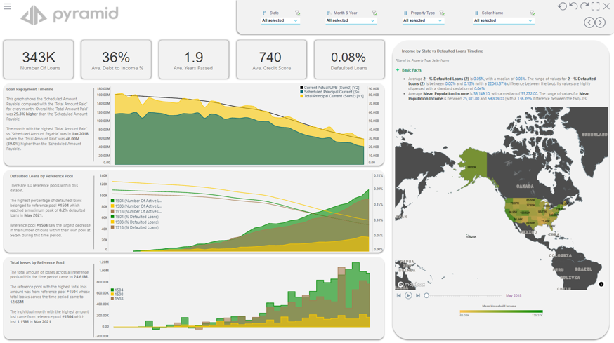
The Start Page shows key KPIs, enables you to filter down to States, Times, Property Type and Sellers. Your filters will immediately adjust the data displayed on all three graphs and the map.
Precalculated Time Groupings to support comparisons in the Market

Our second page, keeps the main KPIs and Filters intact, but changes the graphics to a Bubble Chart displaying Number of Loans as the size and the Colour the Loan to Value Ratio. The Text on the right of this Chart is dynamically derived from further calculations. The same principal of displaying additional context in writing is kept across all three panels. The additional using a Line Chart and a Bar Chart with Popsicles to display additional information.
Interactive Charts and Tables to compare on Product Level

On the final Page the information is condensed into an infographic, this is the Ideal way of creating a summary that then could be printed out or displayed on a public screen.
For further inquiries on this Dashboard, please leave a note below this article.
3 replies
-
On the "income by state..." visual looks like you have smart insights panel on the dashboard. Is there a way to add a smart insights panel to a dashboard? I have only seen this as an action (click) item.