
Dashboard Gallery: Insurance P&C


Insurance Policies and Claims Dashboard
The above dashboard allows a Insurance Agent or district manager a quick insight in a few critical numbers. A total of nine elements combined on one page allow a complete overview over the business.
1. Top Panel: Quick KPIs

Top of the Page is a Matrix Grid with three colour coded KPIs. everything green (or rather blue here). Matrix Grids offer a simple way to show the most important numbers.
2. Line Graph on Policy vs Claims

This line Chart combined with the Toggle Selector below show the running Policies and compare them with the Claims handed in in the same month.
3. Toggle Selector

Using the Toggle Selector, the user can switch between different policies and also show them in parallel on the same chart. If this selector is combined with other visualizations it can control the whole dashboard and allows for more insights at a fingertip
4. Predictions line Graph
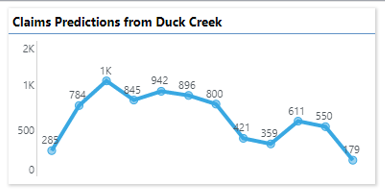
Pyramid Uses several preset prediction algorithms or can include any individual selection embedded via Python or R.
5. Top Agents

Based on the selections above, this chart shows an overview about the top 5 Agents having the lowest claim rates.
6. Bubble Chart Showing Volumes by Product

This scatterplot compares Policy Value with the Premium calculated. Ideally the premiums are close to a direct line in the middle. Policies to the left of the line, created a higher premium per insured volume, to the right a lower premium. The Coloring shows different Insurance Brands. Alternatively the Scatter Chart could also show the current risk calculated.
7. Line and Surface Chart

This Chart combines current values and a YoY Comparison with previous years. To achieve this the values have to be added as a second Y Axis. The Previous Period Value is calculated with a simple formula.
8. Diverged Stacked Bar Chart

This vertical Diverging Stacked Bar Chart (from our Visualization Market Place) overlays New vs Renewed Policies, giving a clear indication how healthy the business is.
9. Clickable Map with KPI based Coloring

Rounding off the dashboard is a clickable/ drillable Map for the region covered. Each State is represented with a Value and Color coded to show how good the underlying KPI is matched. Every state can be clicked and the next layer of information retreived.
Learn More
Learn more about Reporting and Dashboarding in our Learning Live Sessions about Present
Dive deep into this topic with Training in the Learning Hub: https://learn.pyramidanalytics.com/